This is one patriotic effort that isn’t exactly setting off fireworks.
With celebrations for the 250th anniversary of the founding of the United States just two years away, the event’s logo is due for an official unveiling this week during the 250th anniversary of the Boston Tea Party.
With any luck, it will get thrown into Boston harbor, too.
As a report by the professional design website Marketing Brew noted on Thursday, the logo has been greeted with mixed reviews.
“America has a new logo for its 250th birthday,” the headline deadpans. “Not everyone is impressed.”
Not impressed? How could any American fail to be impressed by this?
👋 Allow us to reintroduce ourselves. We have a new look that we’re excited to share with Americans from sea to shining sea. #America250
Learn more about the meaning behind our new logo: https://t.co/wciCPutU9t pic.twitter.com/qBDHRwXEx7
— America250 (@America250) December 4, 2023
“It feels like an early-round idea that should have gone through a couple more … refinements before it saw the light of day,” Ross Clugston, CCO of the New York-based firm Design Bridge and Partners, told Marketing Brew.
Do you like the logo?
That’s putting it mildly.
The logo, supposedly commemorating the birth of the country with the Declaration of Independence in 1776, doesn’t look like an American flag beyond a color scheme that’s not even correct. (Navy blue is AWOL in favor of some marketing monstrosity that’s about three shades too bright.)
There’s not a star in sight.
And that weird, Mobius strip effect comes off more like some kind of Christmas ribbon candy than anything to do with the Founders or freedom, or the Fourth of July.
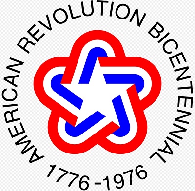
Compare that to the logo that branded the Bicentennial celebrations of 1976:

That logo had the correct shade of blue and was centered around a star.
And while it had a certain ’70s-era funkiness, the way it was encircled with the words “American Revolution Bicentennial: 1776-1976” gave it a reverence worthy of the majesty it honored.
Meanwhile, the no-nonsense sans serif text was as plain-spoken and powerful as the immortal words, “We hold these truths to be self-evident.”
There was, in short, no mistaking it for some kind of gas station promo or the uniform patch of the French gymnastics team.
According to The New York Times, the logo’s designer, Sagi Haviv, a partner in the design firm of the New York-based design firm Chermayeff & Geismar & Haviv, called the ribbon design “an impossible construction.”
“I think that has an additional level of meaning, because bringing people together today is almost an impossible task, but the result is beautiful.”
“Beautiful,” of course, is in the eye of the beholder.
It’s an impossible project and I’m not sure it works as well as they think but here it is. pic.twitter.com/vlARjen8cq
— Paul Gundlach (@PaulSGundlach) December 9, 2023
That is horrible. Who came up with that?
— Chase D. Troutner (@Captain_Strongo) December 5, 2023
To be fair, there are probably people who actually like this logo — or pretend to.
There are, after all, Americans who actually like President Joe Biden — or pretend to. (It’s an admittedly dwindling number, according to polls, but they’re out there.)
If they can find inspiration in Biden’s meandering, dishonest, poorly delivered speeches, they can find inspiration in some Euro-chic, effeminate mishmash of ribbon spelling out the number “250” (if you look real hard).
But the reality is, the logo is about as inspiring as a Biden speech — misguided, full of distractions, and just plain hard to take.
There are still two years left before the semiquincentennial gets going for keeps. Is there still time to get a logo that’s worthy of the occasion?


